Thursday, June 4, 2015

Final Exam


Did you try something that you weren’t sure about as part of this project? 

For this project, I used a more natural theme than I was used to. I wasn't sure if this theme was something I could work with, but I did it anyways, because Mr. Sands encouraged me to take the risk. I wasn't positive that using an actual branch would go well with the fake 'hive' that I created out of plaster, but the natural mixed with 'pseudo-natural' made the entire aesthetic of the piece flow.

Did you pick a material or technique that was new or different over something that was familiar?

I used plaster, placed it on a balloon, and painted over it in order to create a model of a hive. I also used a real branch, pine needles, and pine cones to make the piece more holistic. This was a really new in approach for me, especially in the way of three-dimensional art. I'm really excited to use plaster in more ways, because I actually learned a lot on the logistics of it: how it works, how fast it dries, applying color to it, and how to mix it. Mixing medias, especially those that aren't normally used (like natural medias), was really exciting for me, and it'd be great to have chances to do this in the future. 


When did you step back and analyze your work during this project? 


After I had made only basic, monochromatic versions of my print, I decided I would step up my game and try out new colors. A lot of my peers were also telling me to try ombre or mixed colors on one print. I almost regret not using more colors, but the times that I did try to put more than three colors, it didn't really work out the way I intended. I feel like the two-tone print is the best version on this particular print, which is why I pictured my favorite versions in this blog.


Did you consider how ideas would work before you tried them?
I reflected on how many colors, what colors, and what shade of colors would work the best very often while I was printmaking. I asked my peers almost every print if they had any feedback, and I would use that feedback while deciding on my next print. Also, in the beginning of my project, when I was considering what to make a print of, I was very hesitant to take something as simple as grass. However, this was my first time print making and I realize that the overlapping grass blades, detail, and shape was harder than I first intended. 

Monday, April 6, 2015

Art 3 blog 1

I chose to do this challenge because I thought it would be interesting and kind of like a puzzle to find the poem that I made.  I made it bounce around the page because it made sense on what the message was trying to say. I thought it really applied to me because what i was trying to get across that I don't like boring and dull activities in my life I need excitement and "movement"

Text art


I used text art to create my final project because I thought it was a cool concept.  What I chose to do I thought was clever because it was a lyric from the song "low". Aka "apple Bottom Jeans".  I enjoyed this project because it allowed me to use my imagination and wit.

Wednesday, June 11, 2014

Sticky Situation

This project was one of my favorites and least favorites for a couple reasons.  It was my favorite because I really liked working with water colors the fast pase of it really matched how I like doing things.  I also really liked how water color looks in general I think its really cool how it layers so well.   I didn't like it because the theme was repetitive(I think) and I didn't want to add anything and mess up my jar that worked hard on.  I feel like I could of added something decent, but I didn't want it to be decent I wanted it to match how I felt about the jar.

Mixed Media

This was one of my favorite projects we did.  Once I knew how to make a marbled background from the tissue paper I felt like I got the hard part out of the way.  What got me excited to do this project was the theme because I like things that make you wonder and are questionably controversial.  I liked how I didn't need to plan much for this project it was more in the moment.  I felt like the hardest part of this projects was just finding out where to put the pictures. I really liked how this turned out and I enjoyed showing it to people to see their reaction.

Tuesday, April 8, 2014

Dr. Pepper

I was not happy with the outcome of this can because it looks awful.  I feel like if I would of spent more time on it it would of turned out better.

Candy

I was happier with how this candy turned out in the end then I was in the beginning.  In the beginning I was really struggling with the creases in the plastic but then I got a hold of it

Lolli Pop

I really liked the way this piece turned out.  I was surprised that I was able to create such a detailed lollipop. I was able to capture the color by layering the prisma colors.

Monday, April 7, 2014

Kiwi

The mini lessons were very beneficial to the success of the project because I learned how to
correctly use a color pencil when drawing.  I showed contrast in my work because I made the kiwi standout by using a dark blue background color.  I decided to use color pencils as my medium and I chose them because I felt like I was better at using them then the rest of the options.  The technique that used to create my work was a lot of shading and knowing when and when not to apply pressure.  Overall, I was very please with the out come of my kiwi I thought it looked really realistic 

Scientific

They were very beneficial, I would not of been able to create my final product without the mini lessons because I learned so much.  I showed contrast in my work by making the planets stand out with its dark shading against the white in the tv.  I think it added great detail to the artwork.  I chose to use pencil because that was the medium I was most comfortable with.  I used a lot of shading techniques to create this piece of art.  Overall I liked this project but it was not my favorite because it lacked color.

Thursday, January 17, 2013

Anamorphosis Drawing

1.Describe the process you went through to change your object into the correct perspective to create the drawing. In the computer lab I went on a photo editor and enlarged the photo.  Then, I morphed the photo to make it look the certain way I wanted it.
2. How did distorting and stretching the object allow for you to create a drawing that would look different to the viewer? By distorting and stretching the Dr. Pepper bottle it allowed the drawing to look different because it made the bottle shorter and wider at the top and smaller at the bottom.  This gave the appearance of if you took a picture of it in another angle then it looked the normal size and 3D
3. What were the most important concepts in the project to make it successful?
The most important factor in this project was morphing the picture in the beginning because without that there would of been no picture.  The second most important step was shading and adding values to the picture. 

Game Drawing

I liked my final result in this drawing because if I compared it to the beginning project to the ending, it is amazing.  I first drew the outline of the piece then I colored in most of everything with colored pencils.  Then, I painted a light color of water colors; that was the most challenging part.  But, then I added another layer of color pencils to add the value.

Wednesday, January 16, 2013

1. Explain how you changed your photo in the lab to create a stencil.
  I used Photoshop to switch the original picture to the black and white version.  Then, I printed out the picture, and took a picture of it on a camera and then brought it up on the projector.
2. When creating the collage background explain your choices of colors, materials (magazine paper, books pages, etc), and placement. How does it relate to your topic? If no relation discuss general idea.
 Well there wasn't a lot of materials related to San Fransisco so I just chose a lot of book pages and things related to that because that city is very artsy and what not.  I chose the colors because that is what San Francisco is well known for.
3. Discuss the way positive and negative space was used to create your stencil.
 Positive space was used to out line the object and the negative space was used as the background with all the different colors in it.
4. When using the xacto knife, explain the safety procedures, how to use the knife and any challenges you had to overcome while cutting. 
At first using the xacto knife was quite difficult, but then I got use to it.  I learned not to cut it towards you because it might slice you.  Some times my blade would not go all the way through the paper so I had to make it deeper.
 
5. How was your experience with the spray paint? Discuss how color choice is important, placement of stencil, and any other concepts you noticed while creating this. 
I took a lot of tape to keep the stencil in place. I chose pink because it was the barely used color, so it would be easier to see.  I had to add a few layers of spray paint so it was not as see through.

Wednesday, January 9, 2013

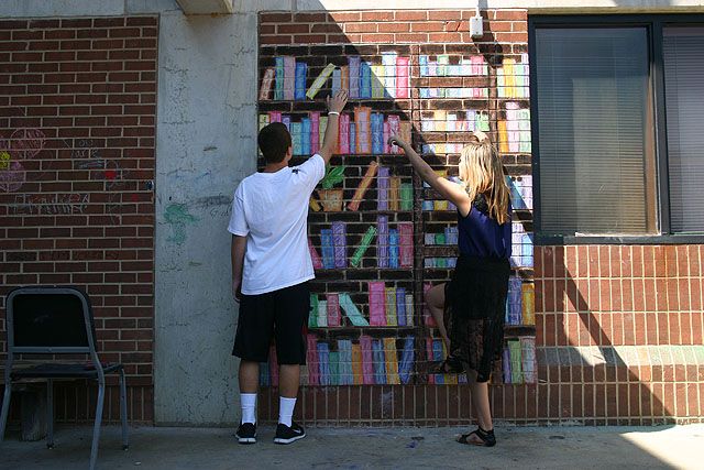
1. Explain your experience working on a team and executing your ideas for the mural. 
Working on a team was surpirsingly easy everything got done very quickly and without a problem.  Executing my ideas on the mural was very easy.
2. Explain the importance of collaboration when working on a team.
Without cllaboration we wouldn't have been able to get anything done. Team work is vital if your work working in a group, plus we were able to work off eachothers ideas.  Collaboration helps get things done a lot quicker then it would of.
3.  How successful was this project? Explain how and why.
I found this project very succesful because after it was done it turned out very well. I am pleased to say that it looks very life like.
4. Explain how you feel about creating artwork that others can interact with. Ex. Invoving the whole school?
I think it is very cool because people tend to have more interest in the art if they can interact with it.  Interatction brings more attention to the artwork and allows more people to apreciate 

Monday, October 22, 2012


1.     Describe the overall composition of your artwork (balance, unity, rhythm and movement). 
I believe that my artworks' blance is very even and porportianial because most of the area is pink but it is balanced out because of bigger items in the picture.  The unity is portrayed because all of the lines are balanced into eachother.  The rhythm and movement are shown by your eyes being drawn to the right and then heading over to the left. 
  
2.     How did you add texture and contrast to your print? Is this important? Why?
I added texture to my print by adding different patternts to it.  The print is contrasted by the thicker and thinner lines that allow this to be portrayed.

3.     Explain how you used positive and negative space to show your image.
I used positive space to show the background and the actaual body and beak of the bird and the details of the branches and vines. The negative space i used at the details of the bird and i used it for the main parts of the branches and vines.

4.     Describe the craftsmanship of your print. (How good the project is technically crafted)
I believe i did a relativley good job at constructing my print make. But, actually printing the picture  was difficult.

5.     Were you able to achieve depth by showing a foreground, middle ground and back- ground? Explain.
I believe I was able to achieve a depth in the foregroud, middle ground, and back-ground by having positive space used as the backgroud, more negative space in the midleground, and more positive and negative space in the foreground.
 
6.     Explain your experience with Printmaking. What were the obstacles and advantages?
Actually printing the printmaking picture was the hardest part about making this.

Thursday, September 20, 2012

Value Portraits Art Critique
                                                                                                                                                        
Self evaluation (must write at least 3 sentences for each question)
1. Explain the process you went through to develop your drawing.
First, I had to outline the different values through tracing paper.  Then, I had to color on the back of the sketch, then flip it over and trace the outline of the values on to a peice of paper in my sketch book. After that, I studdied my photograph and shaded in the value on to the faint outline of the values.
2. Explain how you found the different values in the portrait?
I took a sheet of tracing paper and put it on top of the picture. Then I held it up to the light where I could more easily see the values and began to trace the different values. Then I studdied the portrait and found the all the values, after that i filled in the shapes that were made from tracing.
3.  Did you achieve a full range of the different values within your portrait?  How?
Yes, I did acheive a full range of different values within my portrait.  I did because in alot of places on the skin was lighter shades all over the face in neck.  In the hair the shades were alot darker and it went through a range of medium to dark values.
4. Describe your craftsmanship.  Is the artwork executed and crafted neatly?
I would have to say that my craftminship is the best I could of done.  I believe that it is the neatest I was able to do in the given amount of time that I had. I understand that it is executed very well. 
5. List any obstacles you had to overcome and how you dealt with them.
An obstacle that I had to overcome was outlineing to much values on the tracing paper.  How I delt with this problem was that I only traced a sertaint amount on to the white paper.  Another obstacle I had was dealing with shading the right shade, but after a little bit I got used to shading and I got better at it.

Friday, September 7, 2012

1. Describe your overall thoughts on the final piece.
I thought it was a great mixture of the types of drawing we did in class.

3. How successful do you feel this piece is and why?
I feel that my peice shows the most effort I could of put into the peice

4. What worked about this project? What didn’t work?
Everything but the blending worked.

5. If you were to do this project over again, what changes would you consider making?
I would work on my blending better.

6. What was the most difficult part about completing this piece and why?
The most difficult part was again, blending it was hard to make everything look like it faded into the colors.

7. What did you learn from this piece?
I learned that art is harder than I think it is.